RESEARCH, DESIGN, DEVELOPMENT
PRIORITY WIZARD
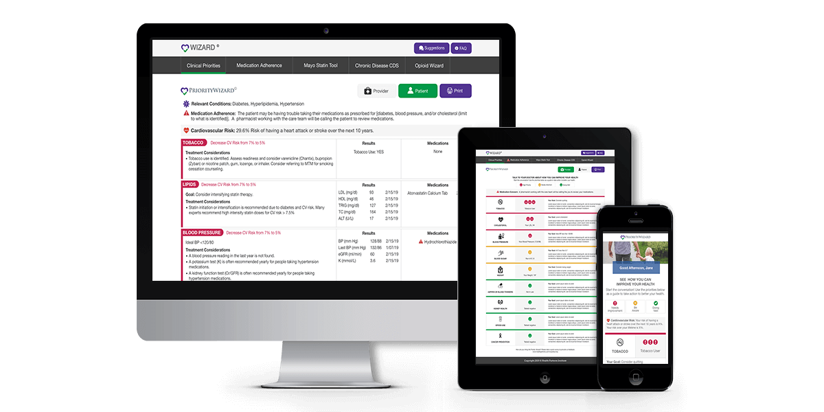
The Priority Wizard is a web application that lives inside of Epic, the software that hospitals use to hold patient data. This application fires and prints a paper copy of the Priority Wizard when the patients blood pressure is measured as high. The paper copies are then handed to the patient and set in the doctors box outside the door for them to see before they come in to the visit. The goal of the Priority Wizard is to help facilitate the conversation between the doctor and patient about cardiovascular health and how the patient can reduce their risk of a heart attack over the next 10 years.
Overview
The Priority Wizard has seen many iterations over the last 10 years. I was brought into this project as the first UX/UI Engineer and have spent a lot of time over the last year learning more about cardiovascular health and taking ownership of the design processes to fully represent the user in decision making. This process has involved interviewing doctors to understand their daily workflow, talking to patients about how they would feel about recieving this information in a primary care visit, and working closely with stakeholders who are trying to turn their vision into a successful product.
I have not only re-designed and developed the Priority Wizard into a newly laid out printed version for the patients to understand, but have also successfully implimented the first iteration of the interactive version of Priority Wizard for doctors to use to place orders, print educational materials, and help make diagnosis right from the web application.
Role & Duration
UX/UI Engineer |
HealthPartners Institute
Research, Information Architecture, Wireframing, Visual Design, Front-End Development, &
Testing
Team of one designer, two developers, data analysts, project managers, & product research investigators
Adobe XD, InVision, HTML, CSS, JavaScript
December 2018 - November 2019
The Problem
After doing some initial user testing on the Priority Wizard it was found that some of the information being presented to patients was confusing, overwhelming, and that the information could be laid out and communicated better. Lower literacy patients had a hard time understanding the priority of goals they needed to accomplish to improve their health and non-English speaking patients didn't know how to interpret this print out at all.
Patients were confused about what certain symbols on the print out meant relatd to their health. Providers wanted to see more relevent data on what the patient could do to change their health and how these changes would improve their cardiovascular risk.
All of this feedback and information needs to be conveyed in a way the user will understand from a printed out black and white version.
6-Pack

The 6-Pack version of the Priority Wizard was the initial design used in hospitals for the past 10 years. The challenge with this version was that the doctors were familiar with this layout and expressed not wanting a lot to change in how they clicked, scrolled, or found information in the application. Early on in the re-design there was a lot of feedback and pushback from doctors saying they prefered this version.
Discovery


The first step was to review the current Priority Wizard and figure out what features needed to be included in the re-design. As a group of one Designer, a few Developers, Project Managers, Investigative Researchers, and Data Analysts we came together to whiteboard and sticky note our initial thoughts on what the new Priority Wizard could do, how it already worked, defining who our users were, how everything could be accomplished within scope, and to create an initial timeline for the team to follow.
After documenting our initial thoughts and timeline I took to paper and started sketching some initial ideas.

Conceptualization
After the initial sketches, I started creating low-fidelity design concepts so the team could focus more on the layout of how the data would be displayed instead of how the application would look with HealthPartners branding. Our main focus was the printed version of the Priority Wizard which was printed right from the application and would be only available in black and white.

UX & Qualitative Research

After getting the approval from the team, we began to conduct our UX and qualitative research interviews with doctors. We created an interview guide that would ask questions reguarding the design and interpretation of the printed version and the work flow during a doctor visit. All interviews were recorded and documented. During our 45 minute interviews we collected a lot of valuable feedback on how we could make the printed and interactive version better for both the patient and doctor, what features they were looking for, and how patients wanted to be more involved in their health and see more of their data.
Interface Design

Creating the interface for the Priority Wizard was a challenge because this incorporated the use of color and symbols. The goal was communicate the priority of the health related concerns with red being "High Priority", yellow being "Needs Attention", and green being "Doing Well". We also changed the symbols initially used to a more universally recognizable symbol, the smile/frown face. Since the color wouldn't be printed for the patient we wanted to convey some interactivity and understanding when the doctor shared their screen with the patient or when the patient saw the printed version.
Goals
The Priority Wizard is in its first itereations of many as we continue to do user testing and qualitative research and expand the tool to be a one stop shop. The goal is to improve the interactive version where doctors will be able to do everything in their visit from the web application.
There are plans to release a mobile app for the patient that will connect to their after visit summary and will provide them with a more interactive way to view how making certain changes in their health can improve their cardiovascular health. Patients will be able to see the progress they are making as their health improves.
